Four tips for identifying AI-generated media
Part 1: Context-less photos
This post contains images that may be difficult to see well over email or on mobile. If you’re having trouble, click “view in browser” on the top right or the article title to open the post on Substack. –Emma
The Massachusetts Institute of Technology (MIT)’s Media Lab lists eight tips for identifying AI-manipulated media. The tips are aimed at deepfake videos in particular and mostly have to do with the face. Pay attention, the site advises, to too-smooth or too-wrinkly skin, to eyes and glasses, especially physics-defying glare, to facial hair, and so on.
The focus on the face makes sense, considering that humans are equal to or better than computer models at identifying AI manipulation, possibly due to our special ability to visually process faces.
Taking a look at a screenshot of a video from the research linked to above, using the MIT Media Lab tips is straightforward. Can you tell which of the two screenshots of the man below has been manipulated?
It’s the one on the left. The biggest tell, in my opinion, is the tone of the skin color on his chin. It’s grayer than the rest of his face and looks weirdly smooth. That mustache, to be real, would also have to be a hair growth and shaving feat—see how it pulls down in two exact lines where the man’s smile lines are naturally? It looks like the hair has been painted on.
Easy! That’s what I was thinking to myself, at least, when I went to participate in the Media Lab’s experiment, Detect Fakes, to test whether I could distinguish an AI-generated image from a real one. I was armed with the Lab’s eight tips. Do your worst, AI. I was ready!
Then I was promptly fooled, over and over again. The first ten questions, I averaged only 30% correct.
There were some that were obvious, like this one of former President Barack Obama. It looks like Obama got put through a bad Claymation animator. And those eyes are the stuff of nightmares.
But can you tell me, with confidence, which of these photos are real and which are AI?
As I went through the Detect Fakes photos, I developed my own tips—a shorter list than MIT’s, although there is some overlap—for identifying AI. I was pleasantly surprised that following them actually worked. I went through 50 photos in total. Halfway through, I was scoring at 60% correct. By the 50th, I had made it to 68%. Not an A+, but interestingly, around the average accuracy score of both people and computer models.
Here are the tips, when used in combination, that helped me the most.
Tip #1: Are the eyes normal?
This is the easiest indication of AI, and I think the one most people know about. AI often obviously messes up human eyes, like this:
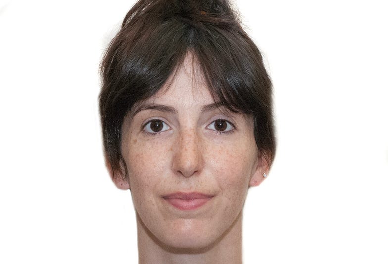
A subtler cue in AI images is that the glare on the eyes is hyper-defined and almost opaque. The light in the pupil is often a perfect white circle. Compare this AI image I made of myself versus a real photo of me. You can tell the AI one by the hair as well—it’s too smooth—but the light in the pupil is also a giveaway.
On the left, the “light” in the eyes is too circular, too opaque, and too bright white to be real. On the right, you can see how light reflects in reality. To be fair, the photo on the right is using only natural daylight and the photo on the left is meant to mimic a studio setting with artificial light. In studio settings—or in something like a passport photo—cameras can produce a pinpoint of bright light in the pupil, but AI tends to overly enlarge and whiten it, making the eyes look unnatural.
Here is an example of a pinpoint of light in a real (and low quality) visa photo.
But wait, you might be saying to yourself—what’s that weird fuzziness on the sides of your hair? Is this really AI? No. It’s a bad Photoshop job, but you would be right to look for those kinds of signs in AI photos as well.
Tip #2: Is the background blurry?
I was surprised how simple but effective this tip is. In AI images, the background is almost always blurry or hyper-realistic (see tip #3). Of course, the background in real photos can be blurry, too, but the AI blur is blurry—exaggerated across the entire background.
I got this photo in the beginning of the experiment wrong. Following the Media Lab’s tips, I had looked at the subject’s facial hair, skin, and eyes. I thought they all looked real. The light in the eyes, even!
But the photo is actually AI. How can you know? The blurry background is a big hint. It’s blur on steroids.
Tip #3: Is the image hyper-real?
On the flip side of blur, there is AI hyper-reality.
In the photo below, there are quite a few indications that the photo isn’t real—the girl on the right has possibly the widest elementary school backpack on earth, and take a look at the spot where she’s holding hands with her mom—but another tell-tale sign is the hyper-reality of the image. Those tree leaves are sharp and so bright, almost neon. The trees themselves are perfectly symmetrical, something you might see on hedges but I’ve never seen on a row of sidewalk trees like these.
The whole photo has even, bright lighting, and the colors are super saturated. This intensity of color is something you see in AI photos a lot. It contributes to that feeling of hyper-reality, almost like their quality is too good to be true.
Tip #4: Are there physical incongruities?
This is another well-known tip, but some incongruities are more obvious than others, and we should become familiar with them all.
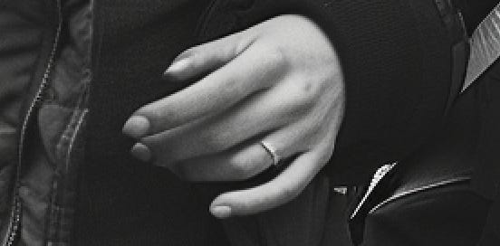
The image below would pass the eye and blur tests. There is a hyper-real quality to it, but when I first saw it on the Detect Fakes site, I was thrown off by the black and white and thought that maybe it was simply a very good photo.
This is where you need to get into the details. Notice anything about the young woman’s sunglasses? How are they staying on her head like that, and where is the second lens?
And how about her front hand:
That screenshot is a bit pixelated, but if you go back to the original image, you can see the weird shape of the pointer finger fingernail as well as the melting quality of the thumb. If you look closely, her ring finger also appears to have a web of skin connecting it at the end to her middle finger.
The last tell that this is AI, and I think the hardest to spot, is the shape of the elderly woman’s eyebrows and her wrinkles.
When you zoom in this close it’s easy to see that her left eye (our righthand side) isn’t real, but it’s harder to clock that in the original image. What you can see in the original is the shape, color, and quality of her brows. They are too perfect. Get that lady an eyebrow gel sponsorship! Compared to the age level of her skin and hair, the brows just don’t match. To top it off, the wrinkle running from the start of her brows to the outside of her face—like a sickle—is something I have never seen in real life. All of her forehead wrinkles, in fact, are too deep to be real, which you can see in the original if you look carefully.
Try the tips yourself
Let’s go back to our original quartet of images to see if we can put these tips into practice.
Going clockwise from top left: image #1 doesn’t pass the blur test or the physical incongruity test (look at the man in the foreground’s pinky finger). The grass is also a shade of neon green that feels hyper-real. It’s AI.
Image #2 has a blurry background, but you can still make out the details of the tree, and there is a lot of detail in the foreground with the pebbles that AI would have a hard time faking. All the men seem to have the right number of fingers, and the photo is high-quality but lacking the super bright, even lighting that you see often in AI. It’s real.
I’m going to blow up image #3 so we can see it better.
It doesn’t pass the blur test, although the detail on the bottles is impressive. Her fingers look okay—although the pinky fingernail is questionable—but the top sliver of that drink is undoubtedly off. Look at how what is meant to be a drink garnish is interacting with the top edges of the glass. Around that area, you can also spot the odd way her shirt is interacting with the glass and the garnish.
And then there’s her overly smooth skin and the white light in her eyes. See how opaque and perfect those circles are, and not centered? It’s AI.
Image #4 has a blurry background, but the photo is so close-up that it could very well be real. The hair is quite smooth, but we know that AI has a hard time with wrinkles, and the wrinkles on this man’s face look perfectly natural. There is no part of his face or neck that is incongruent with the rest, age-wise. And the light in his pupils is dead center, and are tiny, imperfect circles. It’s real.
Image #1 was the first image shown to me on the Detect Fakes site, and I got it wrong. The rest came after I had started identifying patterns in the photos, and using these four tips. I got them all right, an encouraging sign that we can keep pace, to a certain extent—and at least for now—with AI creations.
Try your luck on the Detect Fakes site and let me know how it goes in the comments.


